Amazon Prime Video is rolling out a completely redesigned user interface in its apps across Android TV, Apple TV, Google TV, Fire TV, Smart TVs, Roku and other platforms.
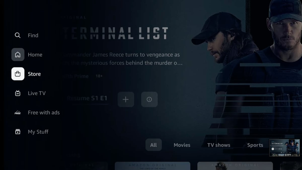
Amazon's new user interface offers simplified navigation with a sidebar menu to the left that is divided into six sections: Home, Store, Find, Live TV, Free with Ads, and My Stuff – with sub-sections for movies, TV shows and sports.
The refreshed user interface, referred to as a "clean slate", is rolling out to all Prime Video subscribers worldwide over the next couple of weeks. Check the app store on your preferred TV device for an app update.
It will be available first on Android TV (Sony, Philips, TCL, Xiaomi etc), Apple TV (tvOS only), Google TV (Sony, TCL, Hisense, Chromecast), Fire TV, Smart TVs (LG, Samsung etc.), Roku, PlayStation (PS4, PS5 only), Xbox (One, Series), and Android mobile devices, with iOS and web browsers to follow.
Takes cues from Netflix
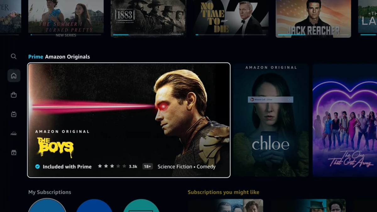
Amazon has found inspiration in Netflix's user interface first and foremost but also HBO Max and Disney+, with its new content carousels and vertical previews.
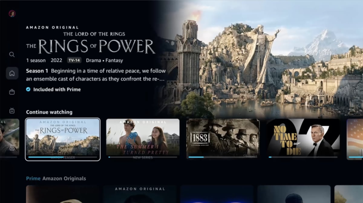
Titles now have a large preview window at the top that includes information on release year, rating, genre, and whether the title is included in your Prime subscription (blue checkmark) or available to rent/buy separately.
Users can filter content by genre or 4K Ultra HD. There is a top-10 chart and a trending section, too.
Existing features such as user profiles, X-Ray content information and Alexa integration remain available. The same goes for ads for partners' content and 'channels'.

The new homepage. Photo: Amazon

The new sidebar menu. Photo: Amazon

Content previews on the new homepage. Photo: Amazon

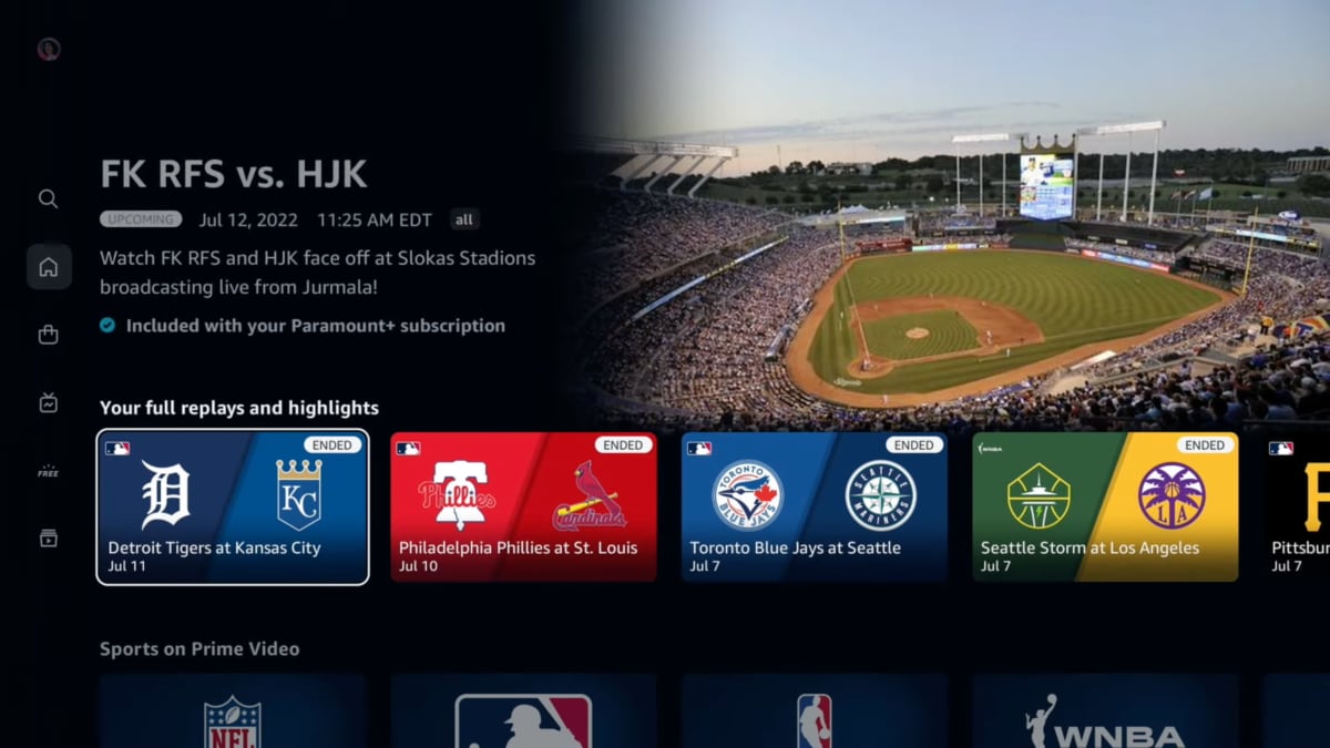
The new sports section. Photo: Amazon

