If you are contemplating one of the new OLED or QD-OLED monitors for desktop work, know that text does not looks as crisp as it could be. It's not due to OLED but rather the pixel structure.
For a couple of decades, flat panel monitors have been synonymous with LCD panels – still used in the fancy "miniLED" or "QLED" models. LCD monitors use a classic RGB-stripe pixel structure, meaning that Red, Green and Blue subpixels are positioned next to each other; three subpixels for every pixel.
RGB pixels are great for text rendering on a monitor.
LG Display's WOLED, which is used in OLED monitors from LG Electronics, Asus, Corsair and others, has an extra white subpixel, so-called RWBG (W for White) or just WRGB. Samsung Display's QD-OLED, which is used in OLED monitors from Samsung Electronics, Dell Alienware, MSI and others, uses RGB subpixels arranged in a triangle – not a stripe.
Such pixel layouts – not OLED – are the reason why text tends to look weird. This is acceptable when using the OLED monitor for gaming, which is the intended purpose of the first mainstream OLED monitors, and even video. However, it not optimal for text rendering in desktop applications.
RGB (stripe) OLED monitors exist but they are much more expensive and the Japanese company producing the panels just filed for bankruptcy protection.
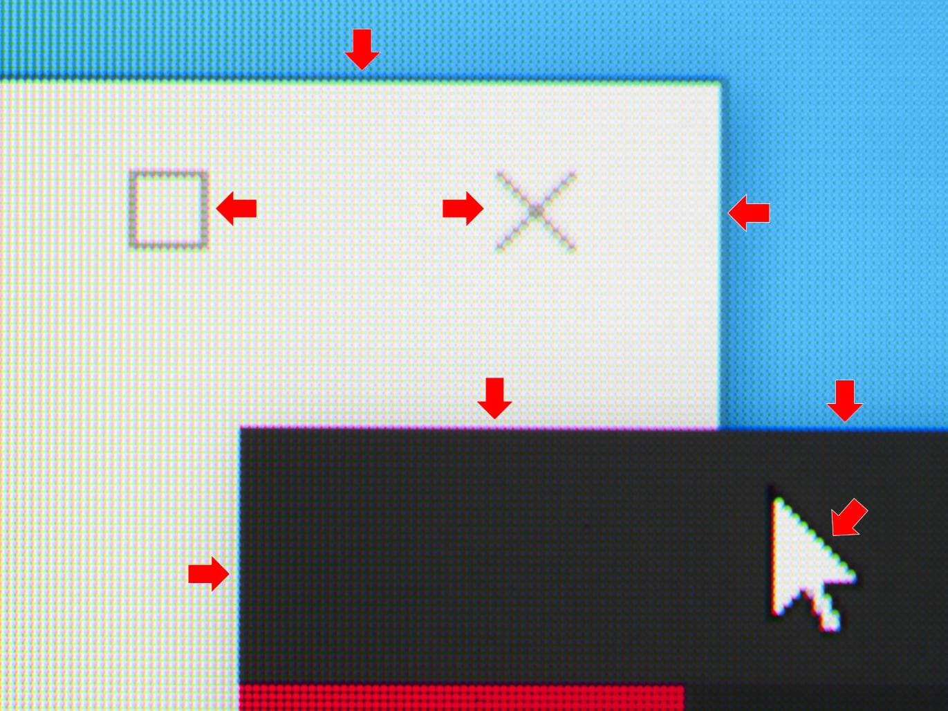
Example of color fringing artefacts caused by QD-OLED's triangular pixel structure. Photo: Mark Mantel, Heise
A proposed solution
Windows' ClearType (anti-aliasing) is designed to make text look better when the pixel layout is classic RGB. Cleartype does not, however, work with the RWBG of WOLED or triangular RGB of QD-OLED.
So you often see 'color fringing' around the edges of text on the screen. It tends to look worse with QD-OLED due to the triangular structure but it is not optimal on WOLED either.
Also read: Samsung responds to concerns over QD-OLED pixel structure
Mark Rejhon from BlurBusters.com is now calling on Microsoft and developers to create 'ClearType 2' to address the issue and also take into account other potential future pixel layouts as well as letting PC users define separate ClearType profiles for each monitor in a multi-monitor setup.
- "It is definitely a real problem caused by unresolvable ClearType limitations," Mark Rejhon wrote on GitHub where he explains and illustrates the issue.
Until the problem has been resolved or at least alleviated, think twice about buying one of the current OLED monitors with the intention of using it for desktop work. Gaming and video? That's another discussion.

